

Buildings that melt cars. Couches made of trash. Hitler teapots. What do these things have in common? They actually exist. The world is full of bad product designs, and each one of them can teach us a valuable lesson.
Product design is hard work. Not only does your product need to function as advertised, it also has to be safe to use and practical. Planning and testing are essential. Based on some of these terrible product designs, we can see the result of poor planning and bad design decisions. And it’s ugly. Let’s take a look at ten of the worst product designs out there (and the lessons they teach us).
#1. A Building That Melts Cars
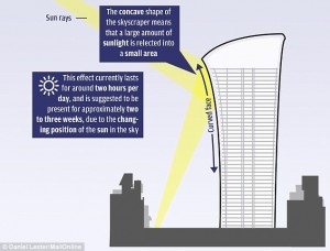
The Walkie-Talkie skyscraper in London is rather beautiful, but it has a little problem. The concave design concentrates sunlight on the street below, effectively cooking everything in sight.
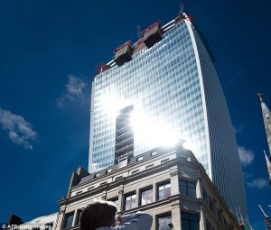
The concentrated light is apparently so hot that local residents have taken to cooking meals on the street. Yes, it’s that hot. How does that work, exactly? During a certain window of time, the sun is angled such that the concave shape of the building reflects and concentrates the light to a narrow region on the street below. This diagram explains it the best:
This is a superb example of design myopia. The product is designed with appearance in mind, forgetting the practical function of the product in the process. Product design is a lot more than making a product that looks good – you also need to consider the impact of your design decisions.
#2. A Couch Made of Trash
It’s finally the weekend and you’ve invited over some house guests for dinner and conversation. You pick up a nice bottle of wine and all the ingredients for a delicious meal. Your guests arrive to be tantalized by the scent of fine herbs and spices simmering in the kitchen, and are greeted with a selection of savory cheeses and a crisp glass of wine.
“Have a seat, make yourselves at home!” you say, gesturing toward a pile of trash in the living room. Your guests get a good chuckle, but you insist. “No, really, have a seat! This is our eco-couch. We’re saving the environment, guys!” Sadly, your friends suddenly remember they made other plans and hurriedly depart your domicile.
Was it the cheese? Did the wine not suit their palette? Or did they simply not want to cozy up in your environmentally friendly new furnishings?
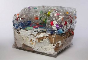
This, my friends, is the XS Chair. Yes, it’s a trash couch. It’s a slightly ingenious idea to reuse old material to build your own furniture. And it’s living proof that not all good ideas are good ideas.
The trash couch gets kudos for reusing waste in an innovative way. But it probably won’t get many people cozying up to it, because it’s just plain gross. The trash couch is a unique product design that has great practical application, but is missing some obvious rules about human nature. More specifically, the one where we don’t like lying in garbage.
#3. The Coffee Cup That’s Guaranteed to Burn
These coffee cups from the Oslo Opera House Porsgrund coffee service are actually quite gorgeous. The distinctive design and attractive angles make for an alluring beverage container. Unfortunately, they also make for an incredibly challenging and painful drinking experience.

The unique design of the handles force you to grip on to the end of a small tab protruding from the top of the cup. While this in itself might be an adventurous way to delicately consume your coffee, there’s an important design element included in the handle.
A small groove has been excavated halfway along the length of the handle, allowing searing hot liquid to pool just a hair’s breadth away from fingertips. As you might imagine, a piping hot cappuccino makes handling this container nearly impossible.
As if the design of the handle wasn’t unfortunate enough, you’ll also notice three tabs at the bottom of the cup. Who knows what purpose they serve aside from making it difficult to stir your drink, and giving you something else to complain about after you finally manage to drink your scalding hot beverage at the expense of leaving fingerprints for a few months.
#4. A Toilet Made for Two
This one really doesn’t need an explanation. This marvelous bathroom design was spotted at MIT.
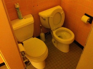
Yes, it works. Yes, there is “enough” clearance.
No, people don’t want to poop with a buddy.
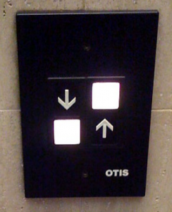
#5. Crossing the Street Has Never Been so Frustrating
Interface design is all around us. Any time we need to interact with technology in our environment, somebody has to design the interface that we use. When it came to designing an interface for a street crossing marker, this designer created one of the most confusing interfaces we have seen.
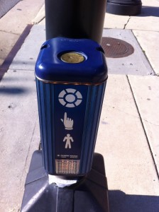
Most of us would be inclined to tap the metal circle on top to initiate the walk sign. Right? I mean, the diagram shows a picture of a finger tapping a circle. Or is that a diagram? Nope, the metal circle on top actually does nothing. The white circle is not part of the diagram – it’s the button. Even though it looks like it’s printed on there.
Much to the dismay of the city of Alexandria, VA, this interface is so poorly executed that citizens have taken to pounding the life out of the metal circle in order to make it work (as you can see by the numerous dents in the picture).
When you’re designing an interface that will be used by thousands of people, you need to test it on a few people first. More importantly, people expect things to be a certain way based on their previous experiences. Most people assume that the big thing that looks like a button is a button, and no amount of diagrams will change that. Similarly in Web design, people have expectations about familiar navigation elements, and one should always exercise caution when straying from those familiar interfaces.
#6. The Phone That Nobody Used
Back in 2010, an Indian cellphone startup called LAVA decided to introduce a revolutionary new product. It’s a cell phone with a full QWERTY keyboard – with one “minor” difference. In an attempt to innovate they did away with the keyboard layout that, oh, every single human being is familiar with, and made this little gem:
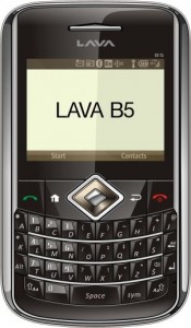
Like #5, this is another clear example of over-designing a product. The LAVA B5 could have been a big hit, but we’ll never know. It flopped miserably. Apparently people didn’t want to relearn everything they knew about typing just to use their new cellphone.
#7. The Car That Loves to Flip
Back in 1973, the Reliant Motor Company produced the first in a line of distinctive new vehicles. The new automobile design revolutionized the concept of driving… by removing one of the wheels. The Reliant Robin was one of the first mass produced three-wheeled cars. And it’s sort of cute.
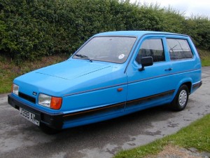
Over time, the unique design and quirky engineering cemented The Reliant Robin in British culture, but was it a successful design? Judging by the long history of ridicule and safety hazards that follow it, the answer is pretty clear. The Reliant Robin wasn’t very reliable at all. In fact, it loved to flip over on even the shallowest of turns.
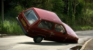
Sometimes rocking the boat is a good thing. Sometimes it gets your customers killed. No product design is worth making a product unusable or putting your customers in danger.
#8. Christmas Just Got Seriously Awkward
Sometimes a product design is functionally perfect, but it commits such a blatant error that it can actually offend and upset your customers. We think this nifty Wolverine inflatable toy fits the bill.
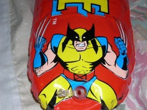
It’s like a human never even looked at it before they went to production. Before you produce a product, make sure that actual humans test it first.
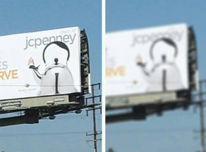
#9. You Can’t Get There From Here
Sometimes a product design decision is so simple, so subtle, that you don’t even realize how terrible it is. This is another example of poor interface design that could have been prevented with a little bit of user testing.
Apparently, the designers figured that the barely perceptible line between the two buttons was a big enough clue for all of us. Even putting those with poor eyesight aside, it’s pretty easy to imagine how many people stood there in confusion before inadvertently taking themselves to the basement.
#10. The Hitler Teapot
The final product design in our list is a prime example of unexpected consequences. What is really a wonderful design has an unintended side effect… it looks a lot like Hitler.
Need we say more? Obviously this was an unintended consequence of the design, but it could have been prevented by testing it on a larger audience.
Lessons Learned
We can learn a lot from the mistakes that others have made. It’s almost painfully obvious why some of these are the worst designs imaginable. But it’s also easy to assume that you wouldn’t make the same mistake yourself.
When you’re deep in the trees, the forest isn’t always in clear view. Whether you’re planning the interface for your next Web design or mass producing teapots, keeping a few things in mind can help you avoid some common pitfalls.
- Don’t deviate from expected behavior unless strictly necessary. This will only lead to confusing your users.
- Test your products in a real-life situation before you take it to production.
- More eyes are better. Sometimes other people will see things just because they aren’t as deeply involved in the design process. Utilize fresh eyes.
- Customers are sensitive. A product might perform as advertised, but nobody will buy it if the product offends them.
Are there any lessons in product design you would like to share? Please tell us in the comments section below.