

If you run a business, you need to know about responsive web design. Responsive web design ensures that your website works on smartphones, tablets and desktop computers. With >50% of Americans going online with smartphones, and even more on tablets, we can’t risk doing things the traditional way. With a hat tip to the old saying “if it ain’t broke, don’t fix it” – a website that doesn’t adapt to mobile devices is a broken website. Time to fix it!

Gone are the days of separate “mobile websites”, tiny little versions of your website on cell phones, and a clunky or broken experience on smartphones and tablets.
Responsive web design works on all devices. One website. One design. All devices. By “responding” to different aspects of each device, we can use the latest in web design technology to deliver the perfect experience on each device without the headaches and overhead of running multiple sites.
The easiest way to illustrate responsive web design is with a side-by-side comparison of a responsive website on various devices (desktop, tablet & smartphone):
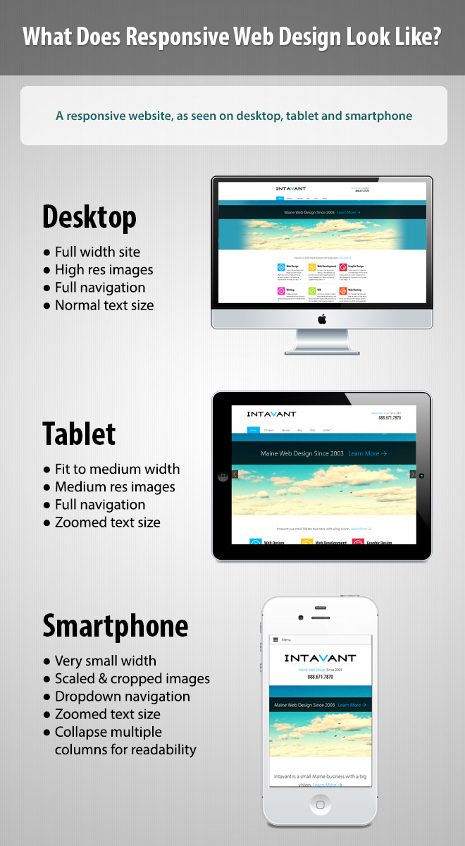
As the above image demonstrates, there are some significant but important changes taking place. We aren’t looking at 2-3 different website designs – this is one design that is adapting to the size of the device. These changes are generally subtle as the goal is to maintain brand consistency while improving the experience. For example, smartphone users have the exact same brand experience, font usage and general site flow, but now have an easily accessible dropdown menu and text sizes and column layouts optimized fully for a small device. No searching and tapping at tiny little links to navigate the site or scrolling and pinching to view a large image.
Let The Numbers Speak
A smart business owner is going to wonder just how important responsive web design is. You can’t sink money and time into every newfangled technology out there, and there’s still a lingering idea that most users do all their “real” Internet browsing on the desktop. So let’s dispel any ideas about responsive design being a fad right now, and kill the idea that mobile users are a negligible percentage of traffic right now.
The Mobile Technology Fact Sheet from Pew Research is an eye-opening document, as well as the Nielsen findings. Here are a few highlights (as of Jan 2014, in the meantime these numbers keep rising):
- 90% of American adults own a cell phone, 58% own a smartphone & 42% own a tablet.
- 60% of cell phone owners go online with their mobile device
- 74% of adults smartphone owners 18+ use their device to get location-based information
- 30% of cell phone users reported using their phone to find a business or restaurant at least once in 30 days
- 29% of cell phones users describe their phones as “something they can’t imagine living without”
- 87% of smartphone and tablet owners use their devices to shop
There are many other great tidbits of data from Pew, but the five facts above should already have your attention. Not only are mobile users becoming a majority, but their devices are used to make key purchasing decisions on a regular basis and to share valuable location-based information.
Not only are users making purchase decisions on-the-go, but also doing research and educating themselves on purchase decisions from their smartphones and tablets at home. There is a common misconception that everyone on a smartphone is rushing about and on-the-go. Not so! Many people are using their smartphones at home, one the couch, with a cup of tea planning their next purchase (or possibly a glass of coffee brandy).
It’s clear that smartphones and tablets are inseparable from our lives now.
What’s The Big Deal?
Your website already works on mobile devices, you say? What’s the big deal, you say? Well, today’s smartphones and tablets are pretty intelligent. We can probably load up the website your company launched back in 2003 on our new iPhone, and it’ll work. Of course, by “work” we mean that you can see the website, and you can click on stuff, and maybe even read the text if it isn’t too small without zooming or tilting your phone around.
But let’s see how much fun it is trying to tap those tiny little links in the menu, or read a lengthy article, or (gasp) view high-resolution media or video! After several unsuccessful attempts at tapping that tiny little “Contact Us” link, we’ll likely give up and move on. More importantly, your customers and prospects will move on. Not only will they potentially move on to a competitor, but they’ll leave with a bad taste in their mouth associated with your brand. Ugh.
And this is all assuming the “best case” scenario for your website; if you have Flash components, fixed widths or any code issues beneath the surface (all too common), it could make the website completely unusable on smartphones and tablets.
Smartphones and tablets are pretty good about forcing even the most poorly coded website to work on the small screen. Generally, this is accomplished by scaling the entire website down to the size of the device. For iPads and other tablets this is usually fine for a basic website, unless you have a very wide fixed layout, a lot of menu items, or fixed font sizes that are hard to read. On a smartphone, scaling your entire website layout down to fit the small screen size will almost certainly make it more difficult to read and navigate, if not completely unusable.
Mobile Isn’t Mobile
It’s worth noting that the line between desktop and mobile devices is getting fuzzy. In fact, it isn’t really a line at all, it’s more like a spectrum; we have devices with screen sizes from a few inches to a few feet and everywhere in between. There simply is no clear distinction between a “desktop website” and a “mobile website” anymore.
As we move forward, it’s important to let this concept sink in because we can’t afford to think about our visitors as either mobile or desktop users. Many users will discover a website on a smartphone, visit again on their iPad, then load it up on a desktop PC with a spouse or friend. Conversely, they might discover a website on the desktop, then save it to their smartphone and tablet to read on the couch or while traveling.
There is single way that people use the Web. When your users are accessing your site from multiple devices and multiple locations, you need to deliver a consistent experience, represent your company’s brand beautifully on each device and separate the entire experience from the particular device they happen to be using.
Finally, Responsive Web Design
It has taken years to evolve to this point, but thanks to a groundbreaking bit of work from Ethan Marcotte on “Responsive Web Design” back in 2010, and thousands of others since then, the Web has been transformed. (For more on the history and technical aspects of responsive web design read What is Responsive Web Design?).
Moving to a responsive design not only solves many of the common usability problems and glitches of traditional websites on smaller devices, it adapts intelligently to each device to make the user’s experience enjoyable – not just manageable. As we move down to smaller screen sizes, we can provide navigation designed for a small device. We can increase the text size and legibility so reading is easy and natural. We can adjust the layout to fit all of our content comfortably on a smaller screen. We can optimize and adjust images to fit the device and flow with the content.
Ultimately, responsive design is about presenting our visitors with an experience optimized for whatever device they happen to be using, thus ensuring that their experience is consistent, positive and enjoyable regardless of the device.
The Dangers of Using a Separate “Mobile Version”
For years, it has been fairly common practice for companies to have a separate “mobile-friendly” version of their website. This is usually maintained and design separately from the main website, has a different URL, and often strips down the functionality and design of the main website.
This might seem like a good thing to do – offering mobile users an optimized experience for their devices – but having a separate “mobile only” version of your website can also be damaging and overly expensive to maintain.
One of the hallmarks of a mobile-only website is that it strips the full website down, often removing wonderful design elements from the full website, or even worse providing a totally different navigation menu and/or content to the user. Back when cell phones were struggling to display websites properly, displaying a “slimmed down” version sacrificed a lot, but it was still better than giving them a broken website.
Mobile-only websites were a temporary fix for mobile devices that grappled to handle the rapidly advancing technology on the Web. Now they are outdated and potentially even damaging to your business. Separate mobile websites cause us all kinds of other problems:
- Run the risk of having two separate versions of your website in Google and fracturing your traffic sources or suffering duplicate content penalties.
- It can be costly, and downright frustrating, to maintain two versions of your website.
- Content is often lost or hidden on the mobile version.
- Users frequently move between devices, and providing them with two totally different experiences on their smartphone and desktop can be confusing and damaging to your brand consistency.
Making Your Current Website Responsive
“This is great”, you say, “but we just launched a new design last year, did we just waste $25k?!”.
As important as responsive design is, there are still some designers and agencies out there rolling out traditional websites. Either due to budget constraints, or simply a matter of timing, as even just a few years ago responsive design faced many challenges that have since been solved.
Whatever the case, you might already have a website that you’re happy with, but it isn’t responsive. Maybe you have a separate mobile website as we discussed above and need to get rid of it. What are your options?
Each case is going to be a bit different. Converting your traditionally coded website to a responsive design will depend on how your website was designed, how complex your content and site structure are, and many other factors. But it is possible. Typically you want to start a new design with a “mobile-first” approach: designing around your content, starting from the smallest devices and working your way up. Reversing this process can be challenging, but it still may be more cost effective than a full redesign.
Assuming your company has a typical web design without a lot of special circumstances, there is a good chance that you can take your design and make it responsive with the right tools and the right web designer. If you don’t have a very compelling reason to stick with your current website design, starting fresh is recommended but not always necessary.
The End, But The Beginning
An era of web design – the era of fixed widths and mobile-only sites – has drawn to a close. A new and very exciting era has begun. Responsive website design is a fundamental shift in how we think about websites and how we design for the future.
Responsive web design is quickly becoming synonymous with web design; it’s no longer just an “additional feature” of a website, it’s a necessary step that all web design technology is falling in line with, and will ultimately be a part of how we design every website in the future.
I hope this article has helped you to understand a bit about responsive web design, its importance to your business and some of the amazing things it can do for your users. It is my hope that you can move forward and make educated decisions about your website strategy that turn your website into a truly powerful tool for your business.
If you have any questions about responsive design or need some advice on your company web design, reach out to Intavant for a friendly consultation or a free quote.